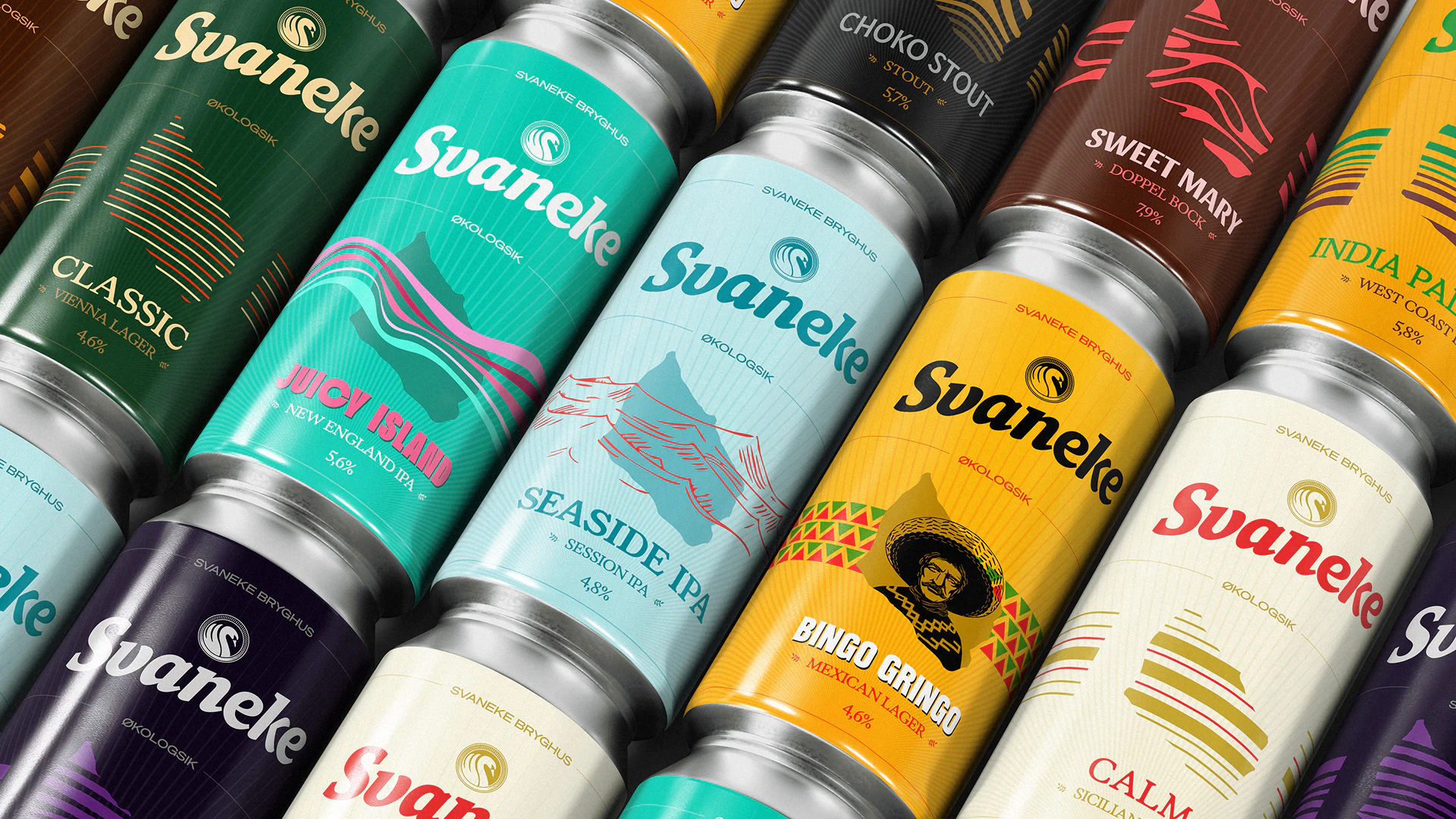
Svaneke Brewery
Enjoy the present, slowly
Client: Svaneke Bryghus
Timespan: Aug '25 - Dec '25
Key Focus: Visual identity, packaging design
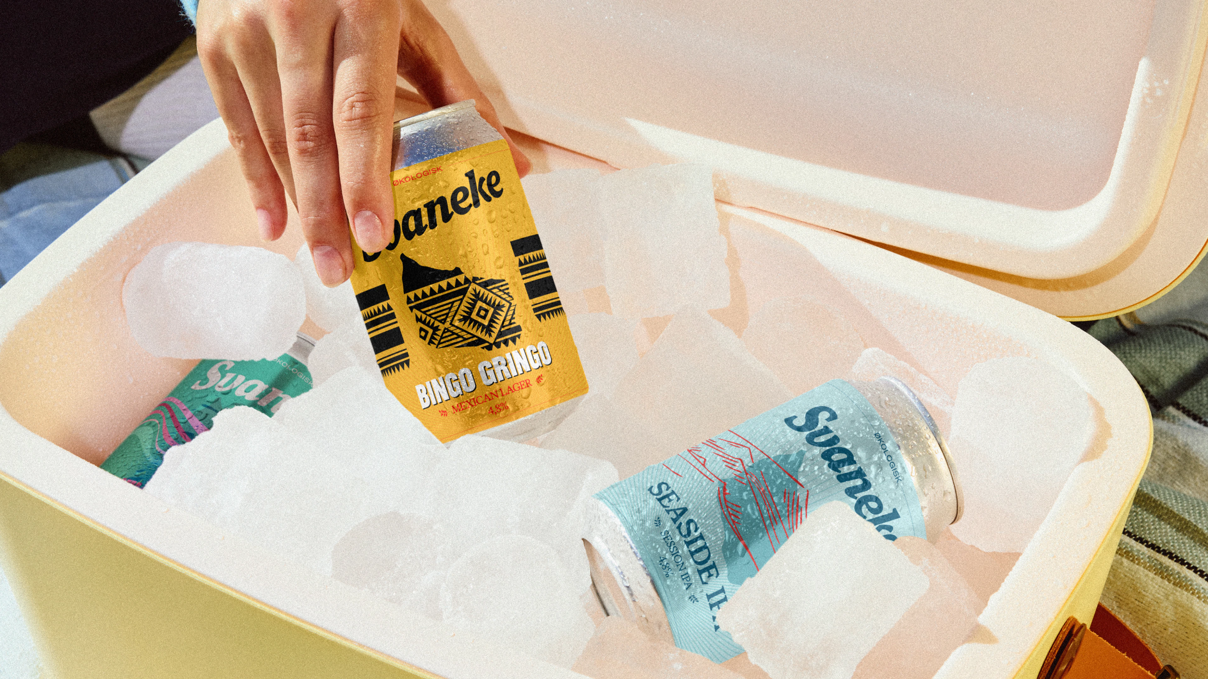
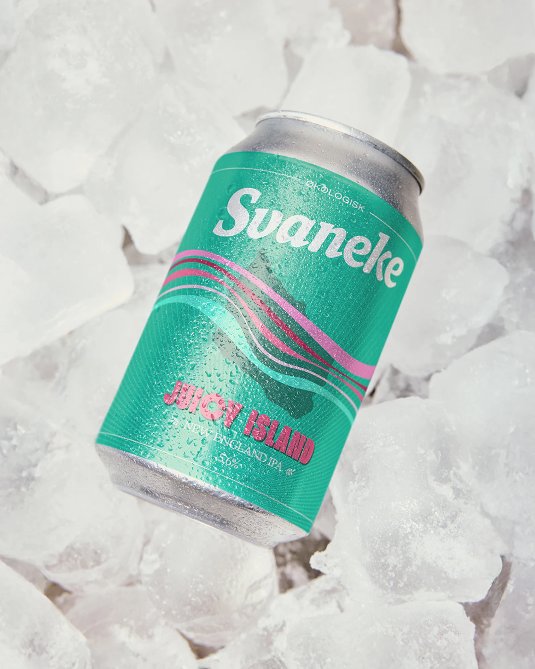
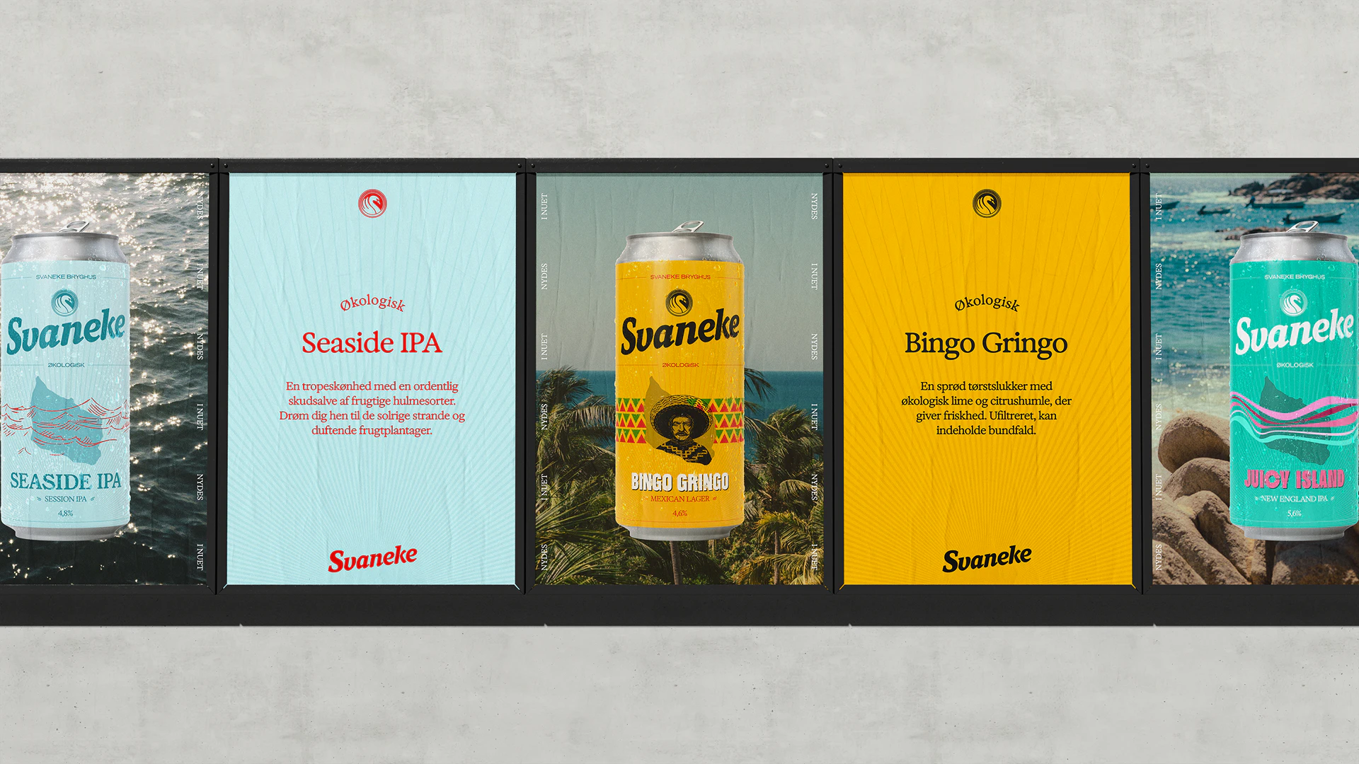
In a world obsessed with what’s next, Danish brewery Svaneke Bryghus chose to pause. Rooted in the island rhythm of Bornholm, the brand embraced a position that celebrates craft, presence, and the beauty of doing things properly — not quickly. The ambition was clear: evolve the brand without losing its soul. The solution was a refreshed position and visual identity that feels as organic as the beer itself.
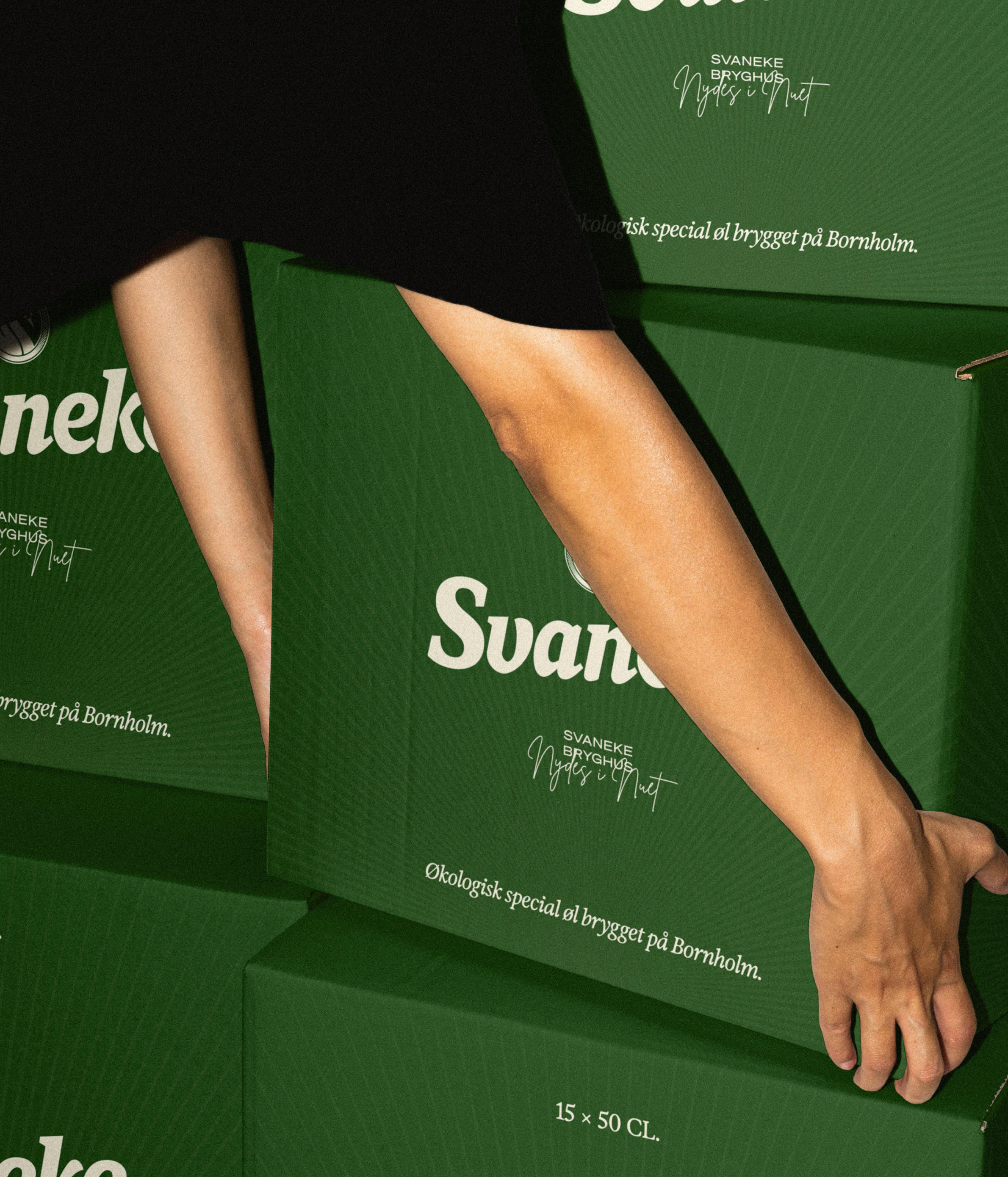
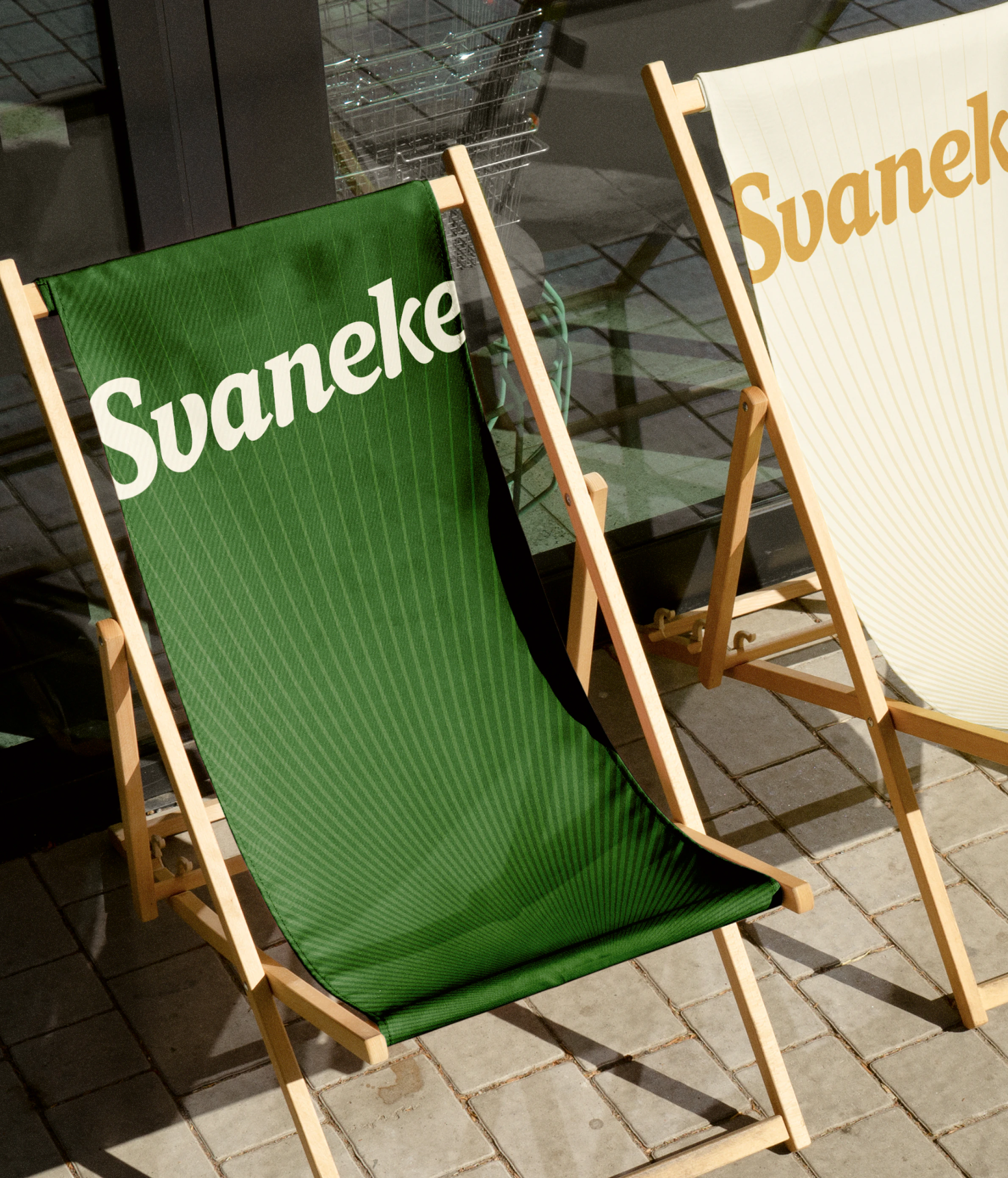
The identity draws from Bornholm’s raw nature, the lines of a sun setting and Svaneke’s uncompromising craftsmanship. A flexible design system now equips the brewery with a cohesive toolbox — from packaging and campaigns to digital touchpoints and in-bar experiences. Every element works harder, tells a clearer story, and scales without losing character.
The result is timeless rather than trendy. Confident rather than loud. Designed to live in the moment, while staying relevant for years to come. Because sometimes, the boldest move forward is to slow down.
Decades of craft behind every sip
Svaneke’s
position
isn’t
invented
—
it’s
earned.
Years
of
brewing
organic
beer
on
Bornholm
has
built
a
credibility
no
visual
identity
could
manufacture.
The
product
and
the
place
do
the
heavy
lifting.
The
brand
simply
makes
it
visible.
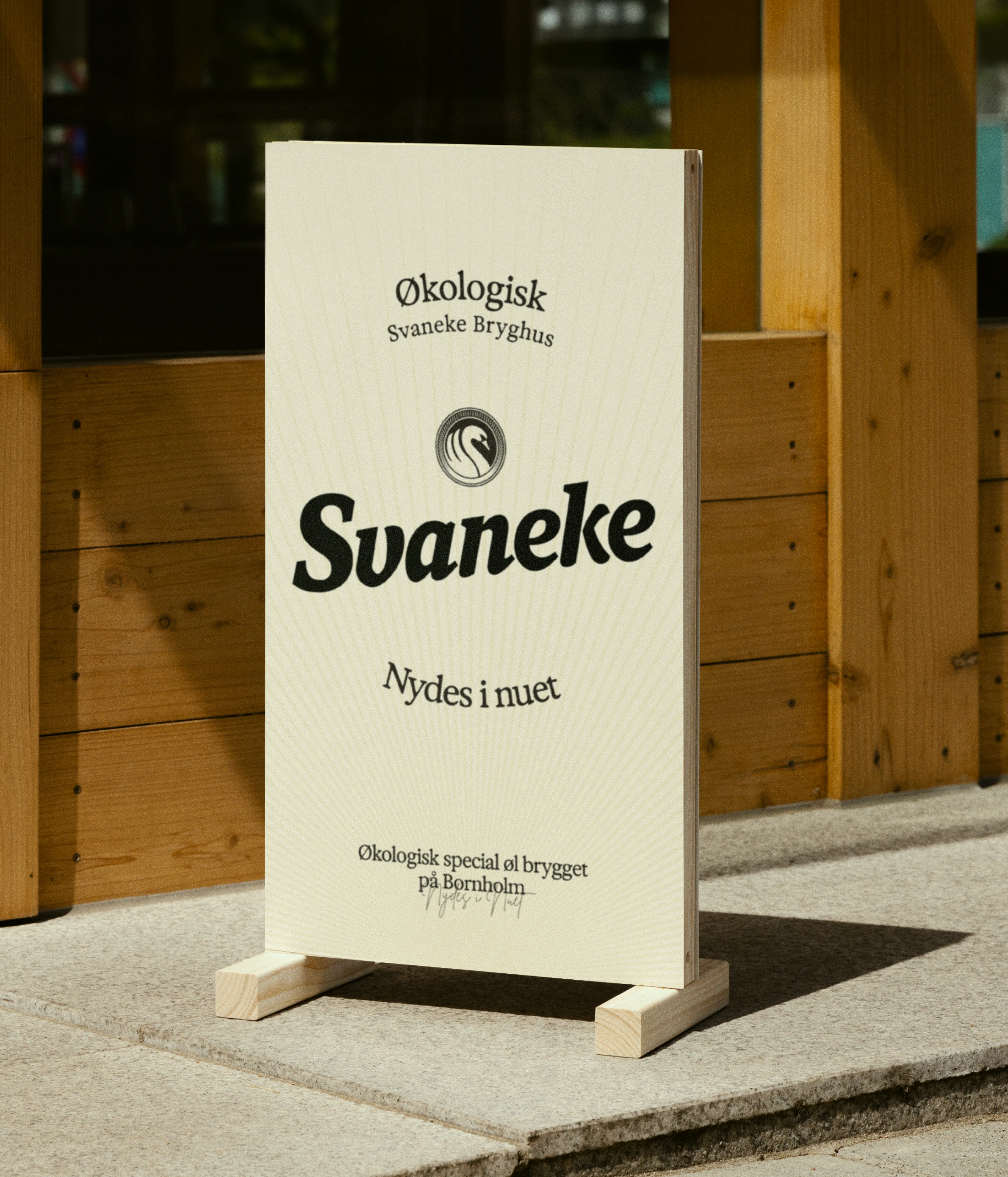
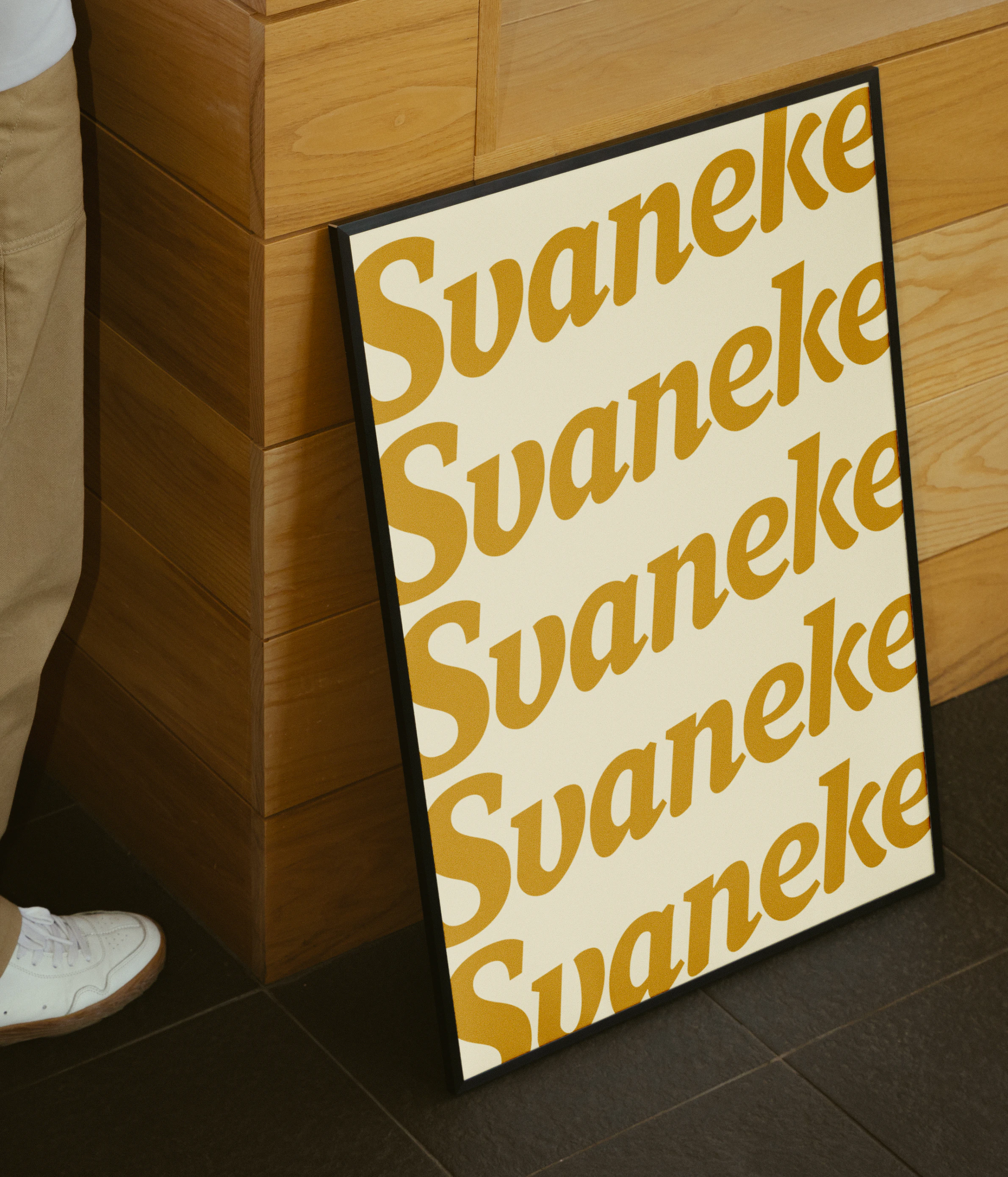
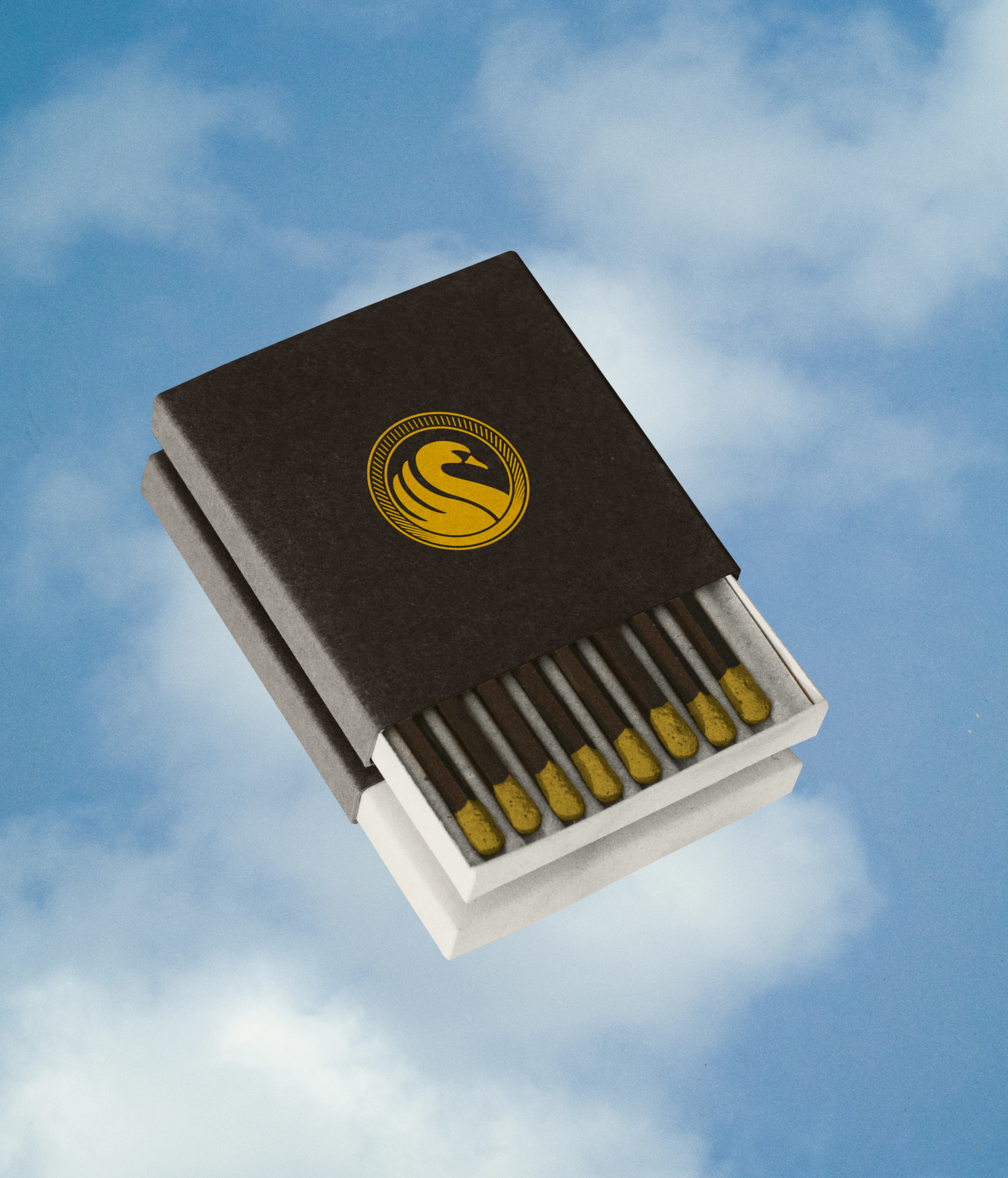
Restored with care, not redesigned from scratch
The
swan
and
wordmark
hold
decades
of
recognition.
Instead
of
starting
over,
the
existing
equity
was
sharpened
and
strengthened.
Familiar,
but
more
distinct.
Refined,
but
unmistakably
Svaneke.
Brewed on sunshine, designed by its rays
Svaneke
runs
on
solar
energy
—
a
detail
too
powerful
to
hide
in
a
footnote.
The
sun’s
rays
became
a
defining
graphic
element,
woven
through
the
identity
as
a
subtle
reminder
of
the
brewery’s
island
roots
and
sustainable
mindset.