RW Blears
With you from formation to exit
Client: RW Blears
Key Focus: Brand, Website
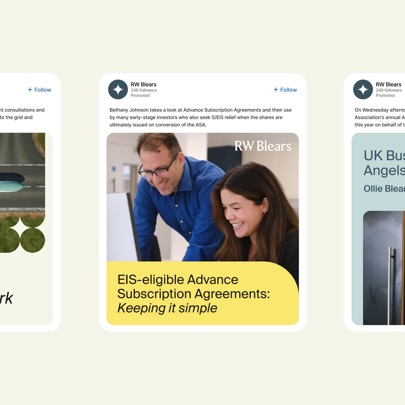
RW Blears has been helping shape the VC space for decades, offering sharp legal expertise in fund establishment, corporate finance, investments, and exits. While their work was agile, their digital identity still reflected a more traditional style rather than focusing on their innovative approach. With a client base of startups, founders, and fund managers, they needed to modernise without losing their well-earned gravitas. Their site wasn’t for lead-gen - it was more like a high-end business card - so it had to be clear, engaging, and unmistakably RW Blears.
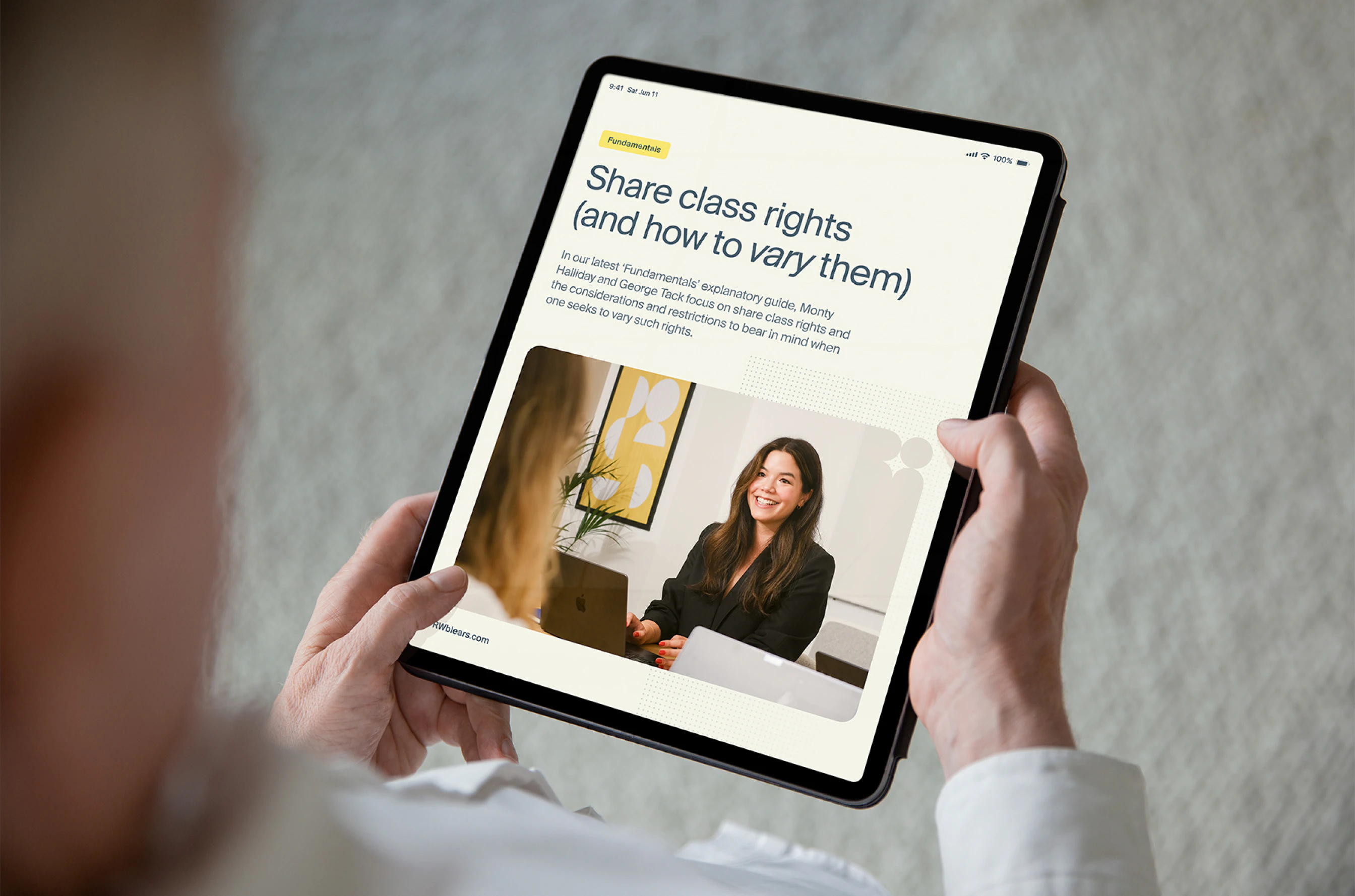
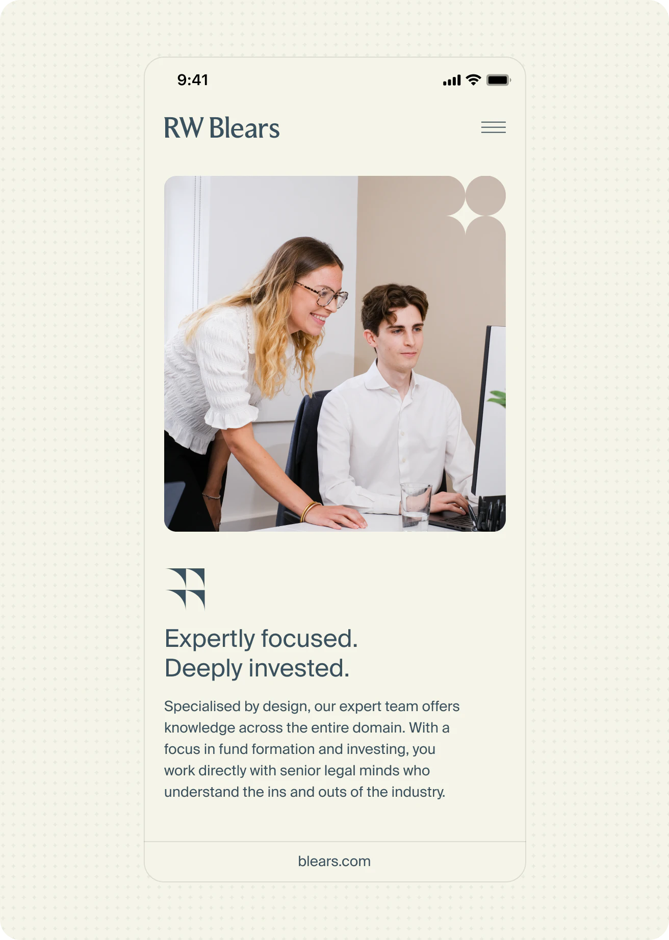
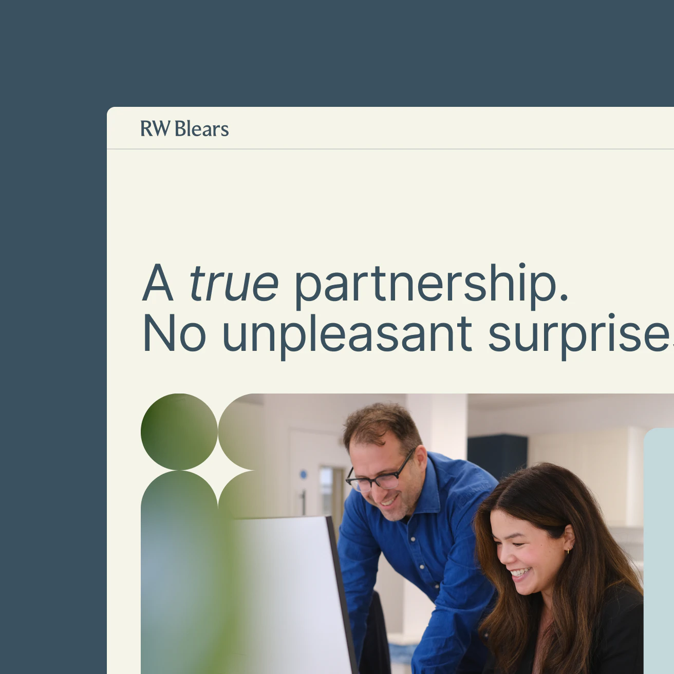
We took an evolution, not revolution, approach. The goal: show their adaptability - approachable yet authoritative, traditional yet tech-ready. Instead of listing every possible service, we focused on how they partner closely with clients across the entire fund journey, from capital formation to exit. The brand needed to feel personal, flexible, and tailored - like the legal equivalent of a bespoke suit. The new identity kept their trusted blue but added a burst of vibrant yellow for energy, balanced with light stone and airy blue variations. Navigation was restructured to highlight expertise, and fresh photography captured the team’s personality in action. Subtle animations and a star-motif graphic system added warmth and dynamism, resulting in a brand that feels as nimble and future-ready as the firm itself.
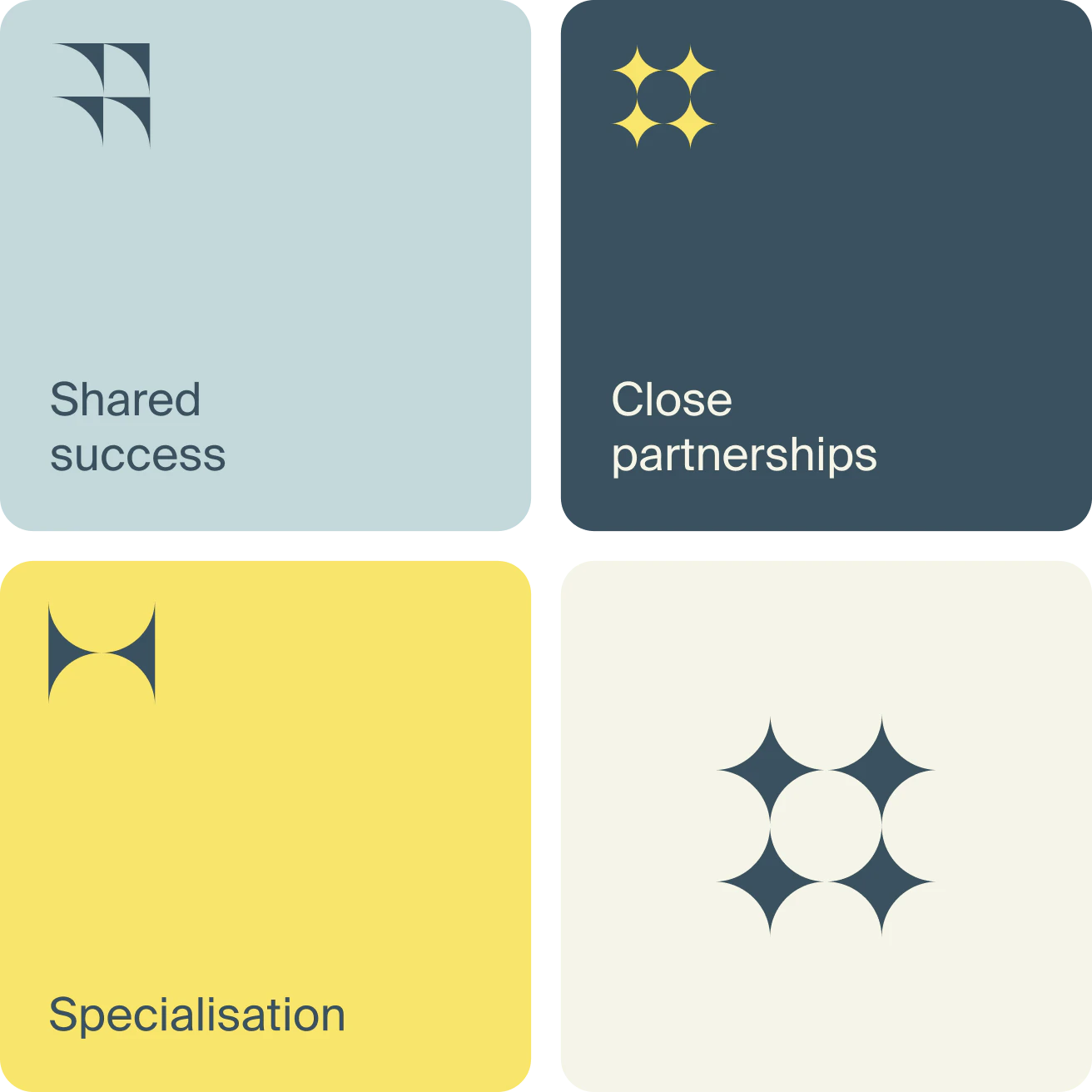
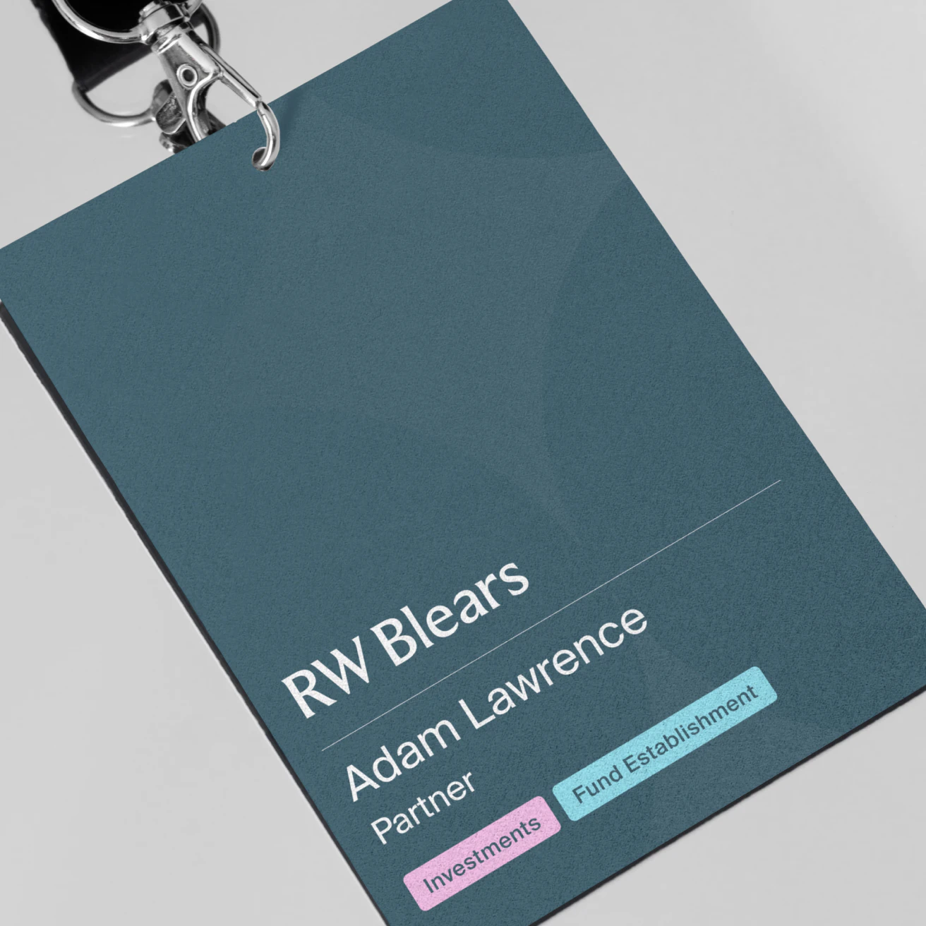
A
star
motif
is
used
throughout
patterns,
masks,
and
icons,
symbolising
expertise
aligned
around
client
goals
Clear
navigation
and
playful
micro-interactions
create
a
user
experience
that
is
both
engaging
and
human
Kudos to
Project Lead / Matthew Staroste
Designer / Adam Hutchinson
Strategist / Gabby Olivas