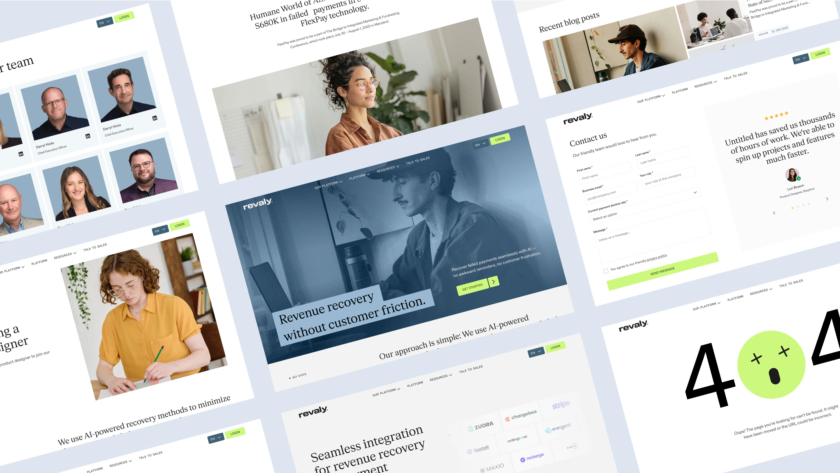
Revaly
Because performance doesn’t stop at purchase
Client: Revaly
Timespan: Apr '25 - Sep '25
Key Focus: Strategic Positioning, Brand Identity, Web Design
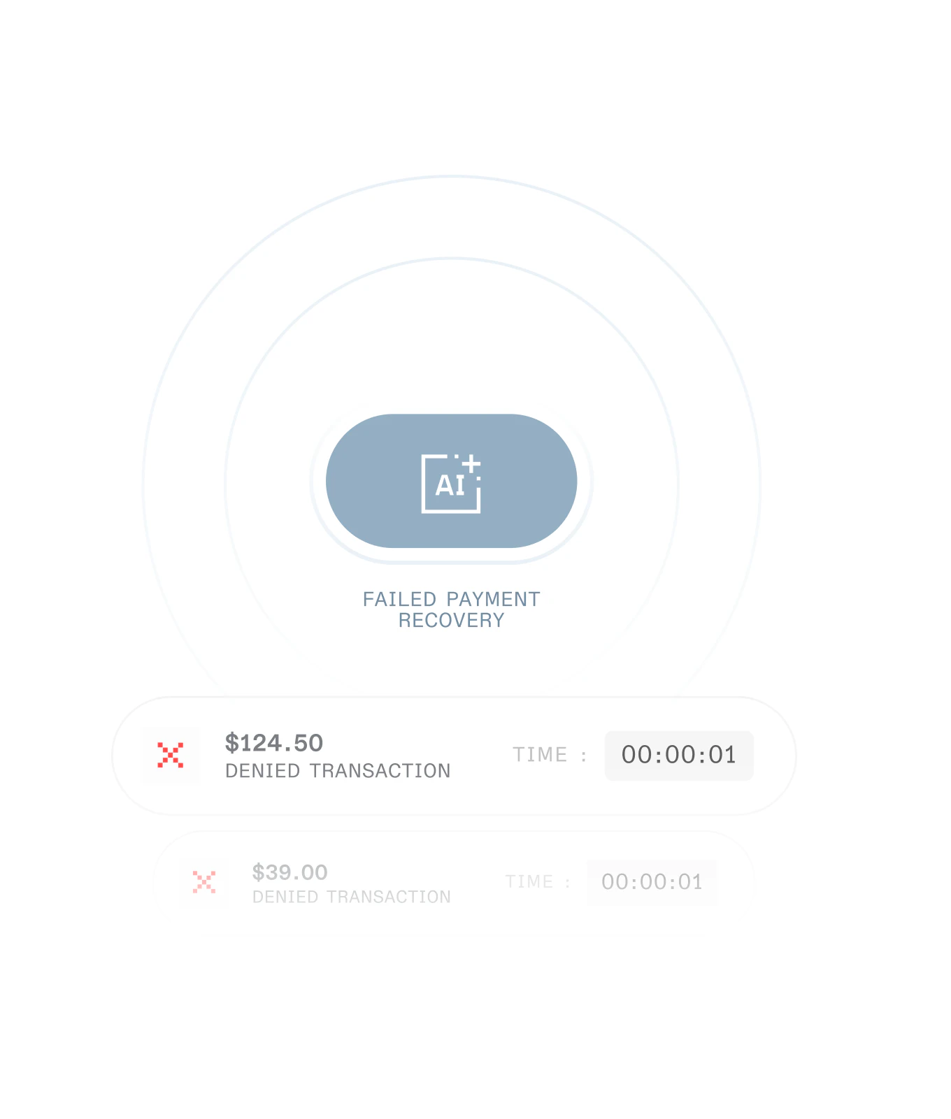
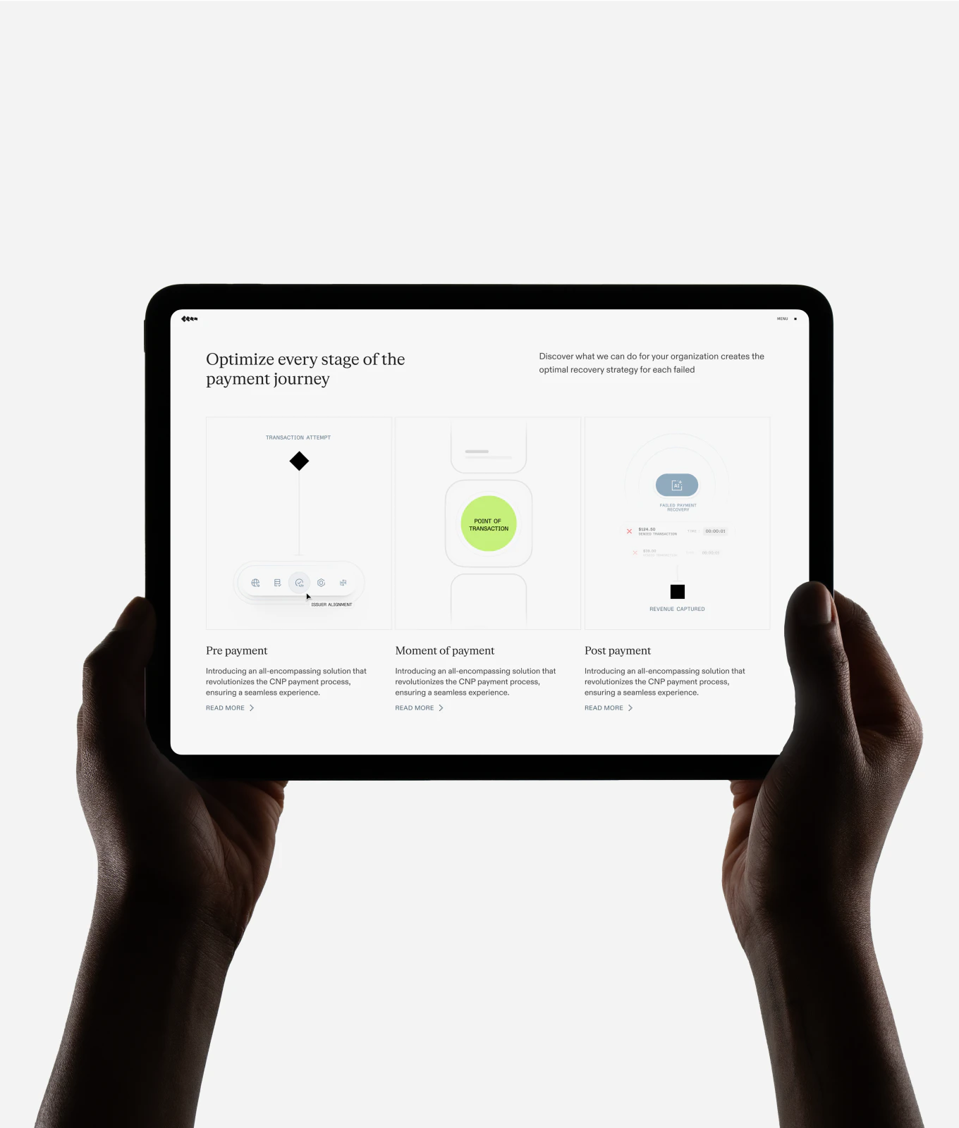
Payment performance is a growth lever hiding in plain sight. Too many transactions fail due to minor errors that compound into a critical amount of missed revenue. Revaly has built the solution, now it needed to position itself as the go-to performance partner for revenue owners.
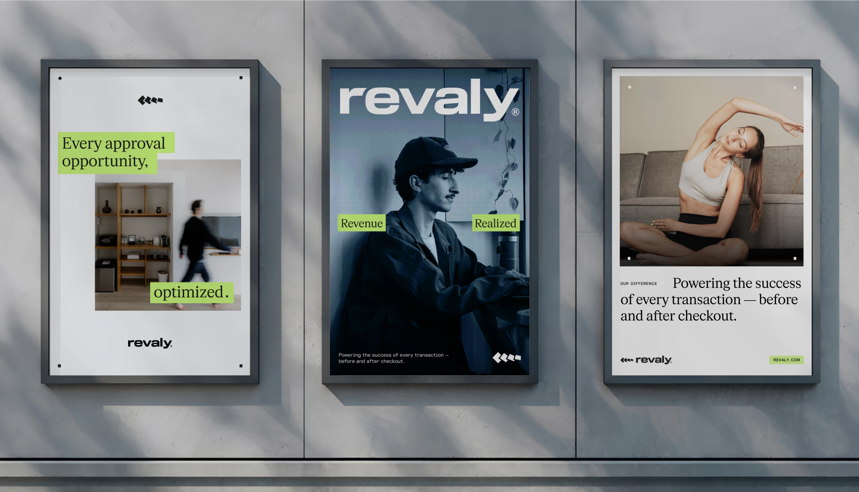
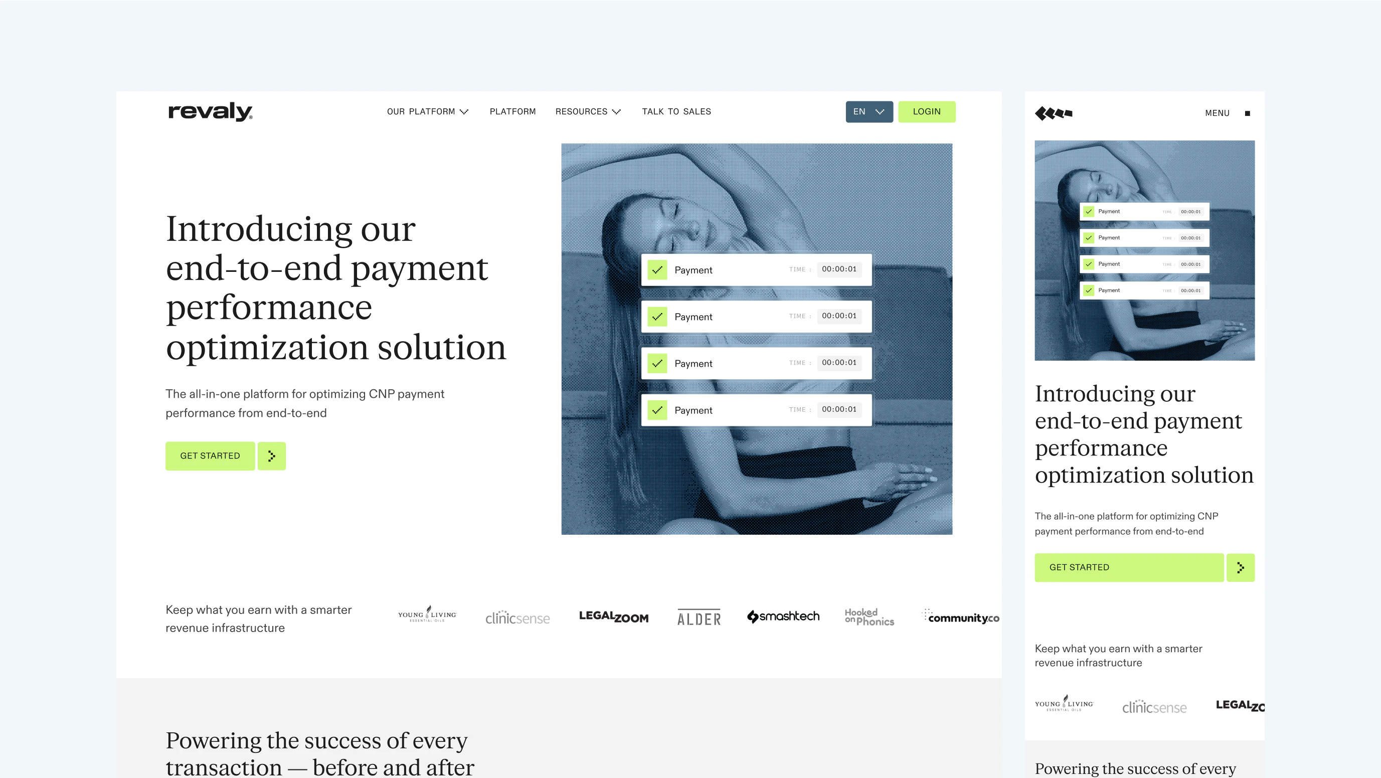
Fundamentals aren’t always exciting when they should be. With its new brand, Revaly now stands as clear and powerful as the product behind it - built for revenue leaders ready to optimise, recover, and grow.
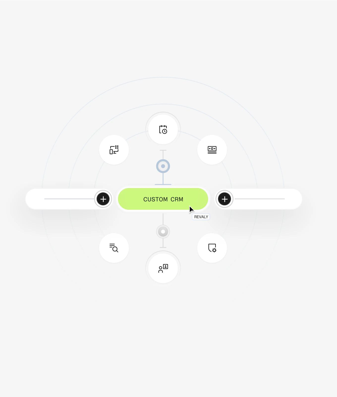
Strategy and design move as one: revealing the unseen, organising the complex, and making every approval count. The strategic platform speaks directly to those accountable for top-line growth, while the visual identity brings this clarity to life.
Revaly now has a brand as sharp as its product — ready to help modern businesses keep payments flowing, customers engaged, and revenue growing.
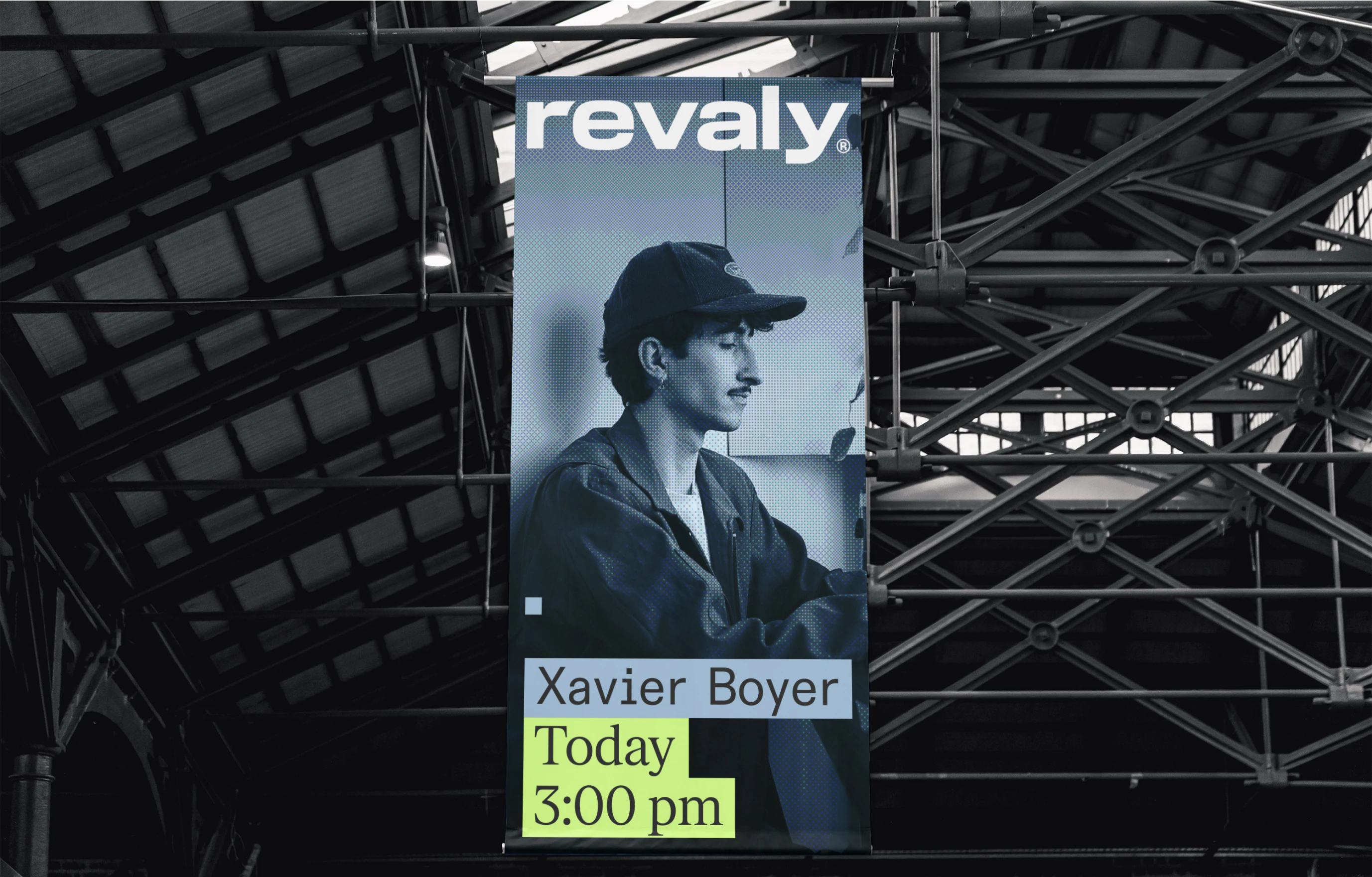
Revaly’s
logo
pairs
a
clean,
confident
wordmark
with
a
distinctive
lowercase
“r”
that
signals
approachability
and
precision.
The
accompanying
free-flowing
symbol
captures
the
brand’s
core
promise:
seamless
momentum
from
purchase
to
approval.
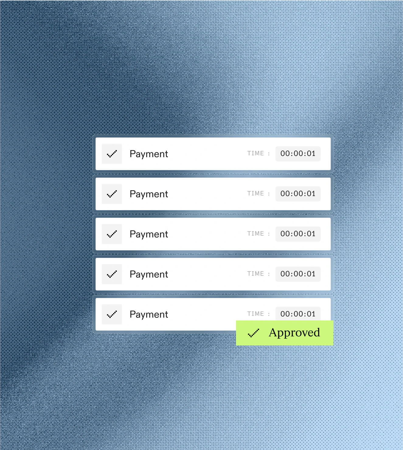
The
dither
effect
was
introduced
as
a
subtle
yet
distinctive
visual
signature
—
a
digital
texture
that
adds
depth
and
motion
without
overwhelming
the
design.